E-Commerce

Lotto. 

Visit website
test

Overview

As Lotto prepared for a strategic kickoff into India’s digital retail space, BOMBAYDC was entrusted to design a seamless and spirited digital experience; one that captured the brand’s playful soul while meeting e-commerce benchmarks.

Our mission: to translate Lotto’s legacy and its new quirky brand voice into a compelling, intuitive platform that celebrates the joy of play at every click, scroll, and checkout.

Key takeaways

  1. Designed a conversion-first checkout design that plays differently

  2. Immersed users in the 'joy first' brand philosophy across digital experience

  3. Reimagined a storied legacy for a new generation

01

Designed a conversion-first checkout design that plays differently

To support Lotto’s business goals, we designed an e-commerce flow that doesn’t just sell—it plays.
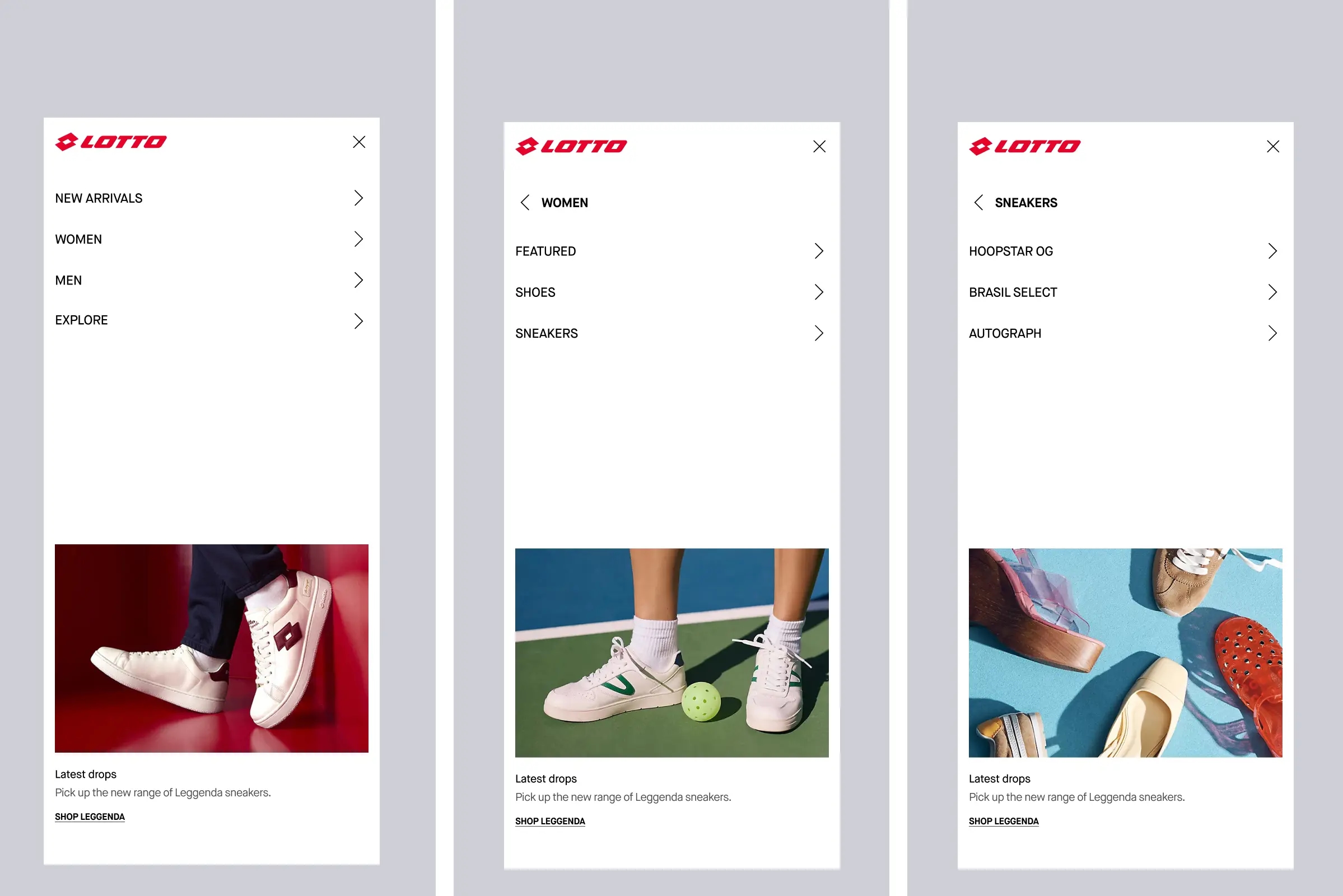
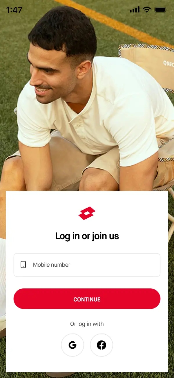
A playful, conversion-driven journey. From animated homepage and lifestyle-led product pages to order status, keeping every scroll seamless and shoppers engaged.
Every homepage scroll was intentional, with clean product showcases delivering key info at a glance, creating visual rhythm and keeping users engaged.
For Indian shoppers, mobile experience is the experience, so every interaction was made mobile-first, ensuring a fast, intuitive, and visual experience.
The homepage footer closes with social post previews revealing product info on hover and linked directly to the product page, enabling a seamless shopping journey.
We designed a product listing page unlike anything. Feature-rich cards with a mix of static product shots, lifestyle videos, and hover-reveal transitions, breaking the monotony of traditional grids.
Created a product detail page that opens with a mood-first slider led by a lifestyle product video, followed by static product angles and colour variations, offering a 360º view from the get-go.
Size selection transformed into “Add to Cart”, with a drop-down size chart, simplifying the buying journey through in-page interaction. No redirections, no friction.
We introduced Select Size, Product Details, Return Policy, Care Tips, and Reviews into one cohesive flow, followed with rich A+ content rounding off the product story.
Introducing smart shopping, we created a dual-pane layout that lets users toggle between their shopping bag and wishlist, making decisions easier and faster.
A cleanly designed customer dashboard places orders, returns, wishlists, and account info upfront with Recently Viewed products at the top to support shopping continuity.
lotto
A clean, categorised navigation menu was built for clarity, allowing users to move quickly and intuitively through the app.
We designed a welcoming onboarding journey, complete with rotating microcopy like “Personalised Shopping”, “Free Delivery”, “Stress-Free Returns” and more.
lotto
A clean, minimalist login form made account access smooth and distraction-free.

02

Immersed users in the 'joy first' brand philosophy across digital experience

Lotto’s refreshed philosophy—“Joy First”—and its cheeky, neighbourhood-commentator persona needed to come alive across every page.
lotto
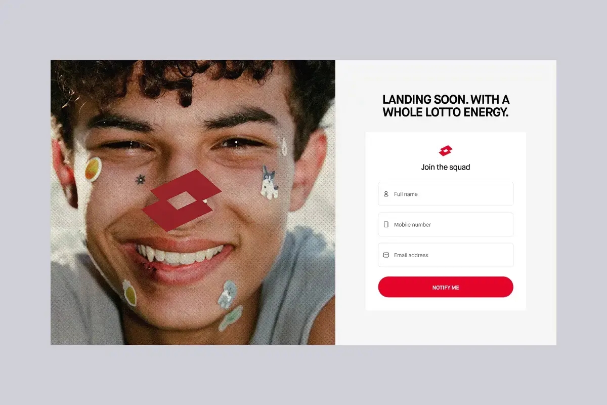
A lively pre-launch screen was designed to tease, engage, and capture early sign-ups through a simple “Join Squad” prompt.
lotto
Translated across the UX through microcopy that plays, puns, and leaves a smile — like “A whole lotto joy”, “#LOTTOLIFE”.
lotto
Lighthearted, joyful copy sprinkled across the site keeps the Joy First spirit alive in every interaction.

03

Reimagined a storied legacy for a new generation

Lotto’s iconic history deserved more than just a timeline so we reimagined their heritage.
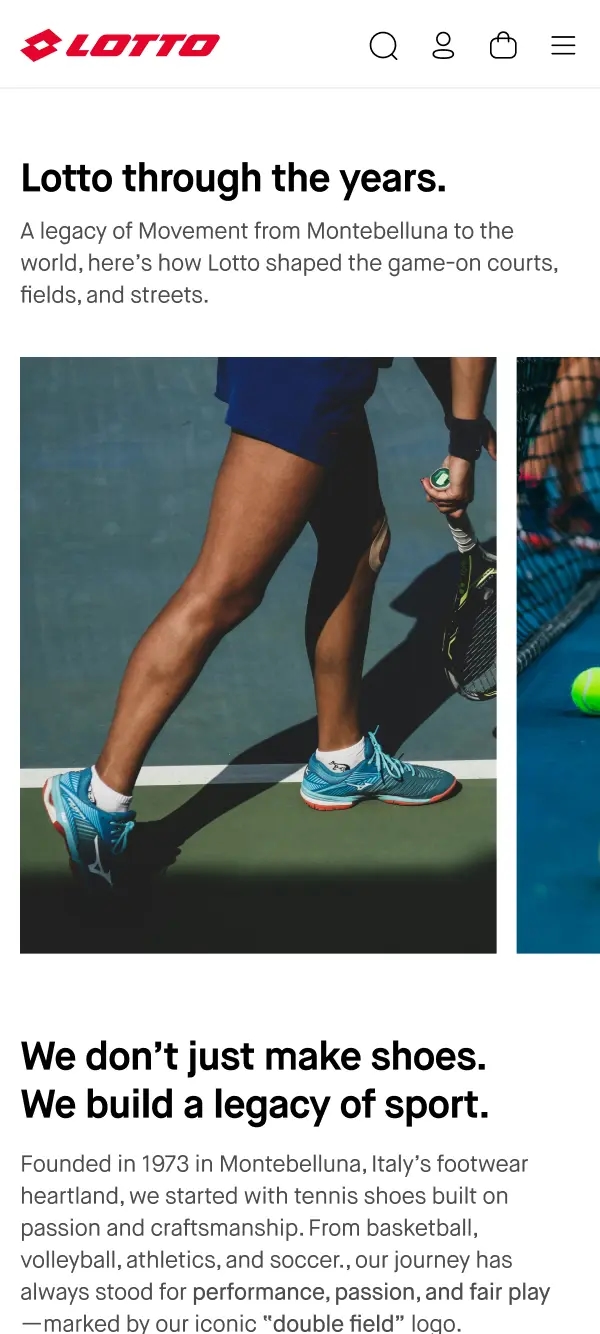
The About Us section was designed as a scrollable, visual journey that unpacks Lotto’s Italian heritage with rich storytelling and playful, conversational copy.
lotto
The About Us section was designed as a scrollable, visual journey that unpacks Lotto’s Italian heritage with rich storytelling and playful, conversational copy.