Banking & Finance
Kotak Net Banking.

Overview
Furthering our track record of delivering clutter-free design, reducing human complexity and delivering premium-quality digital design, we have been working closely with Kotak to transform the average Indian’s banking experience.
Outcomes
1700
Branches served
28
States of India
32.7M
Customers
Useful & usable
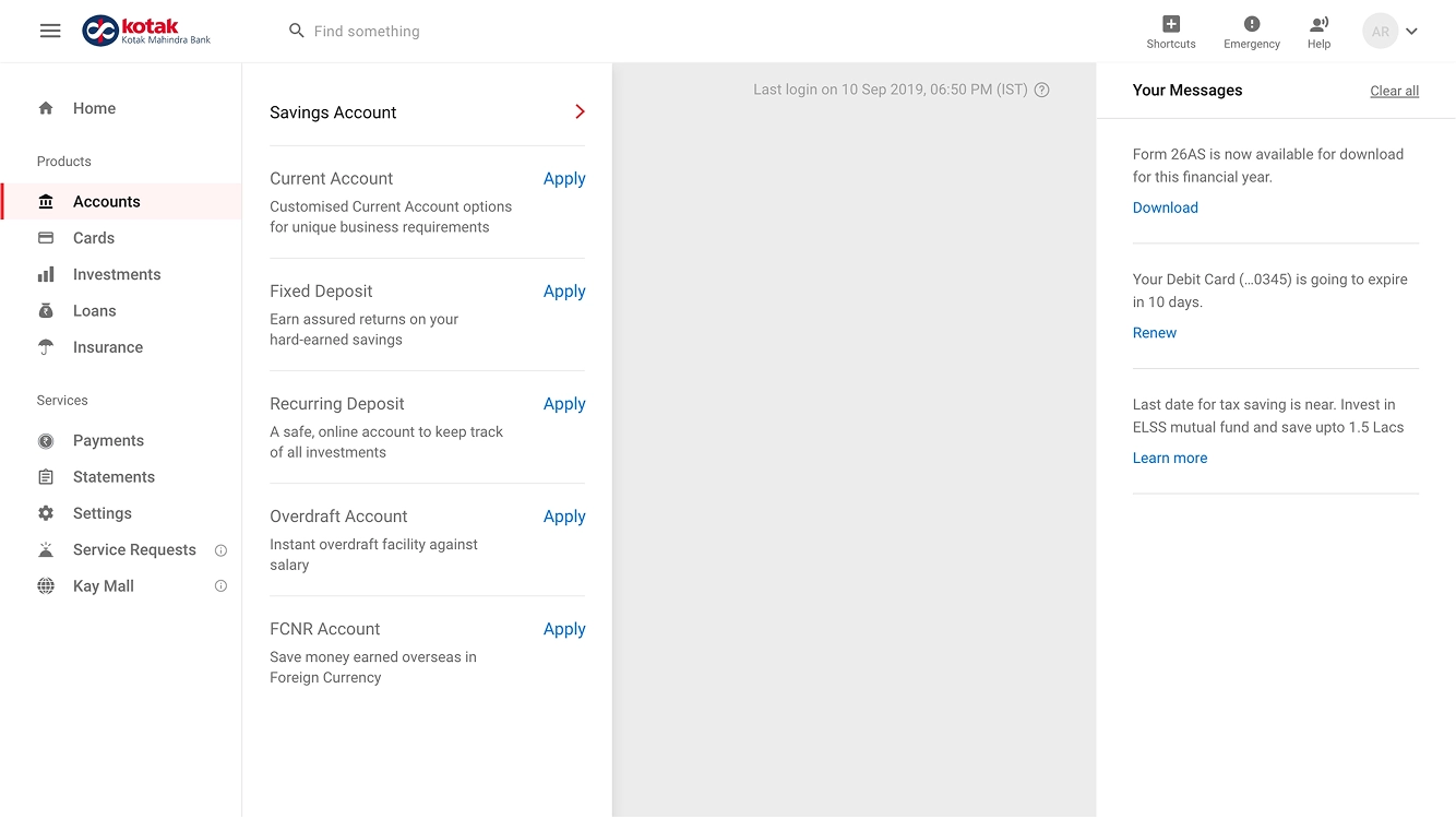
Customers often have several kinds of accounts, like deposit accounts, credit accounts, investment accounts, etc. By deeply researching the important needs of the users, we could rethink our net banking dashboard in new ways. We created a mechanism in the banking dashboard to provide a useful and usable banking user experience for multiple accounts so that the activity in all accounts would be easy to review, monitor and manage.
Onboarding experience
It was important for users to also adopt the digital platform with ease, so we created an onboarding experience that helped familiarise the user with the new online banking journey while showing them personalised actions and laying out the standout features. This ensured users can use the new banking experience without any human error, resulting in a superior experience across the site.


More Examples
In another example, a financial status overview was the first thing we showed users after logging in as a tactic. There were many possible login scenarios for all our personas and we had to account for all permutations with unique, personalised designs e.g. where the user has multiple accounts and/or manages accounts with other people.
Grouping
We had a feeling based on the laws of grouping from Gestalt psychology that understanding and exploiting the abilities of the human visual system is an important part of the design of usable user interfaces (Rosenholtz et al., 2009). Accordingly, we categorized required and correlated information and grouped them for ease of use.
Effortless
To enable customers to pay routine bills effortlessly, our online banking design offers the ‘upcoming payment’ widget as a solution. Our goal was to spotlight key actions the user needs to take and preserve a minimal visual density to ensure ease of use.

Human-centric
We knew that theoretically, people trust AI more when they feel it provides personalised content, otherwise they think their uniqueness is being neglected. (Longoni et al., 2019).

Clarity
Another important pain point our UXR brought to light was that users simply want to see how much withdrawable money they currently have. We created a human-centric mechanism for this by giving users the option to view their detailed closing balance without the lien amount. We further mention the ‘cheques in clearing’ amount for the user to have complete clarity of the withdrawable amount.
User control
A sense of control is like an inherent reward which activates the same brain areas as a reward (Leotti and Delgado, 2011). When it comes to managing and updating the basic settings of a user's account, card or security settings in the new Kotak Net Banking experience, we created the control centre for the user to easily view and update some basic details. This tactic contributed well to our core tenets of delivering a useful system.
Access
Humans are cognitive misers. We love taking shortcuts. This inspired us to add quick links to frequent tasks on the dashboard. This makes tasks like downloading an e-statement a breeze (Stanovich, 2018).
Security
To help users feel more confident about managing their money through online banking, we designed solutions to assure users that their accounts are safe with Kotak. For instance, during an unexpected situation like the loss of a card, users are worried about the misuse of their card. During such times the users need to take immediate actions to prevent any fraud. BOMBAYDC, along with Team Kotak devised the plan to build the 'emergency' tool that puts together all actions a user may need to take, in an easily accessible place with a simple two-step process.
What is going on atm?
Bank customers have historically reported a lack of clarity and assurance. Our dashboard is designed to be transparent and personalised, prompting users the right information and support at the right time. Our thoughtfully designed UX makes use of empathy and always keeps the user in the loop about the status of their actions. Design should always show what stage a user is at by providing consistent and timely feedback, and that too, crisply and clearly.


Information design
Instead of focusing on features and visual design solely, we focused on the goals that real users want to accomplish on a banking site and the challenges they face while doing so. Leaving visual design for a later stage, we made sure our interface was efficient and effective first. Some of the information design tactics we deployed are as follows:
Right information, right place
We created a page from which the user has all profile related information in one place to manage and update with ease. There, customers can effortlessly edit their details, add contact details and upload documents.
Simplified architecture
The other key piece of the puzzle was the architecture. We needed cognitive alignment of the architecture to be in perfect orchestration with the user.
Unified design system
Based on the principle of functionality before form, we decided to expose our usefulness and usability before the form. But as both need to work well together, we pre-planned the approach to fuse them. By looking at the UX from the perspectives of customer needs, a simplified architecture, and the information design, we had the essentials to plan the visual strategy. Tactics we deployed are as follows:

Atomic design approach
By applying an atomic design methodology from the get-go, we built a consistent, flexible system which, in the future, will help Kotak’s internal team create custom page layouts to introduce new products. This helps maintain our design philosophy in a scalable, replicable manner.
Digital-first banking
As an integral piece of creating a unified design system, we took a digital-first banking approach for Kotak and to provide a consistent and cohesive experience to the user, we established a new, digital-first tone of voice with dynamic writing guidelines.
Systemic impact
With over 1700 branches across 28 states delivering a superior experience to over 32.7 million customers, our net-banking implementation has touched the lives of many.
It was an exciting challenge to have Kotak, a trailblazer in digital innovation, as a client. We brought their value proposition to life and setting a new standard, we have designed innovative digital solutions by looking through multiple lenses. As a consequence, we also went head to head with the wider digital banking landscape among users and banks. We helped Kotak maintain its edge in the competitive landscape. We are proud contributors to this decade of digital development in the banking industry and have aided India’s efforts to be on par with global standards of banking digitalisation.
We saw a significant decrease in complaints toward Kotak after our deployment and also helped contribute to Kotak's successful growth through increased customer satisfaction. In the end, we were happy for the opportunity to design for a new India.
Our ultimate goal here at BOMBAYDC is to harness design for national development while pursuing arts and technology. If you would like to learn more about how we innovate, contact us today.
References
Bhai P.S., L., 2018. E-BANKING IN INDIA - PROBLEMS AND PROSPECTS. International journal of current engineering and scientific research, 5(01), 2394-0697.
Bergen, J. and Julesz, B., 1983. Rapid discrimination of visual patterns. IEEE Transactions on Systems, Man, and Cybernetics, SMC-13(5), pp.857-863.
Boudet, J., Gregg, B., Rathje, K., Stein, E. and Vollhardt, K. (2019). The future of personalisation--and how to get ready for it. [online] McKinsey & Company. Available at: https://www.mckinsey.com/business-functions/marketing-and-sales/our-insights/the-future-of-personalisation-and-how-to-get-ready-for-it.
“Digital Revolution in the Indian Banking Sector.” Forbes India, ForbesIndia, https://www.forbesindia.com/article/weschool/digital-revolution-in-the-indian-banking-sector/47811/1.
Gunning, D., Stefik, M., Choi, J., Miller, T., Stumpf, S. and Yang, G., 2019. XAI—Explainable artificial intelligence. Science Robotics, 4(37).
Garett, R., Chiu, J., Zhang, L. and Young, S., 2016. A Literature Review: Website Design and User Engagement. Online Journal of Communication and Media Technologies, 6(3).
Harshil Mathur (2020). UPI Steals the Thunder in 2019! [online] Razorpay Blog. Available at: https://razorpay.com/blog/upi-2019-transactions-data/.
HFI. (n.d.). Human Factors International. [online] Available at: https://www.humanfactors.com/newsletters/ if_yuo_can_raed_this_yuor_brian_wroks.asp [Accessed 1 Apr. 2022 ].
Hick, W., 1952. On the Rate of Gain of Information. Quarterly Journal of Experimental Psychology, 4(1), pp.11-26.
Hyman, R., 1953. Stimulus information as a determinant of reaction time. Journal of Experimental Psychology, 45(3), pp.188-196.
IBM (2019). Design Systems as a Service| IBM iX. [online] www.ibm.com. Available at: https://www.ibm.com/services/ibmix/design-systems-paper/ [Accessed 1 Apr. 2022].
Leotti, L. and Delgado, M., 2011. The Inherent Reward of Choice. Psychological Science, 22(10), pp.1310-1318.
Iyengar, Jhumkee, and Manisha Belvalkar. “Case Study of Online Banking in India: User Behaviors and Design Guidelines.” Human Work Interaction Design: Usability in Social, Cultural and Organizational Contexts, 2010, pp. 180-188., https://doi.org/10.1007/978-3-642-11762-6_15.
Malhotra, Pooja, and Balwinder Singh. “Determinants of Internet Banking Adoption by Banks in India.” Internet Research, vol. 17, no. 3, 2007, pp. 323-339., https://doi.org/10.1108/10662240710758957.
Longoni, C., Bonezzi, A. and Morewedge, C., 2019. Resistance to Medical Artificial Intelligence. Journal of Consumer Research, 46(4), pp.629-650.
Norman, S., Avolio, B. and Luthans, F., 2010. The impact of positivity and transparency on trust in leaders and their perceived effectiveness. The Leadership Quarterly, 21(3), pp.350-364.
Nielsen, J. and Molich, R., 1990. Heuristic evaluation of user interfaces. Proceedings of the SIGCHI conference on Human factors in computing systems Empowering people - CHI '90,.
Rosenholtz, R., Twarog, N. and Wattenberg, M., 2010. Filtering in feature space: a computational model of grouping by proximity and similarity. Journal of Vision, 7(9), pp.313-313.
Rosala, M. (2020). User Control and Freedom (Usability Heuristic #3). [online] Nielsen Norman Group. Available at: https://www.nngroup.com/articles/user-control-and-freedom/.
Stanovich, K., 2018. Miserliness in human cognition: the interaction of detection, override and mindware. Thinking & Reasoning, 24(4), pp.423-444.
Xie, B., Zhou, J. and Wang, H., 2017. How Influential Are Mental Models on Interaction Performance? Exploring the Gap between Users’ and Designers’ Mental Models through a New Quantitative Method. Advances in Human-Computer Interaction, 2017, pp.1-14.
Van den Eijnde, J., 2020. The Human Touch in Kitchen Technology: How Technology Changes Our Relationship with Food in the Rational and Ritual Kitchen. APRIA Journal, 2(1), pp.68-84.


